
From template to order: how we built the Lyntev website
Our website brings together information about our services, the chance to try them out and ordering. In this study, we show how we connected those parts and what you can check for yourself: choose a design, adapt it to your brand and review your choices before proceeding.
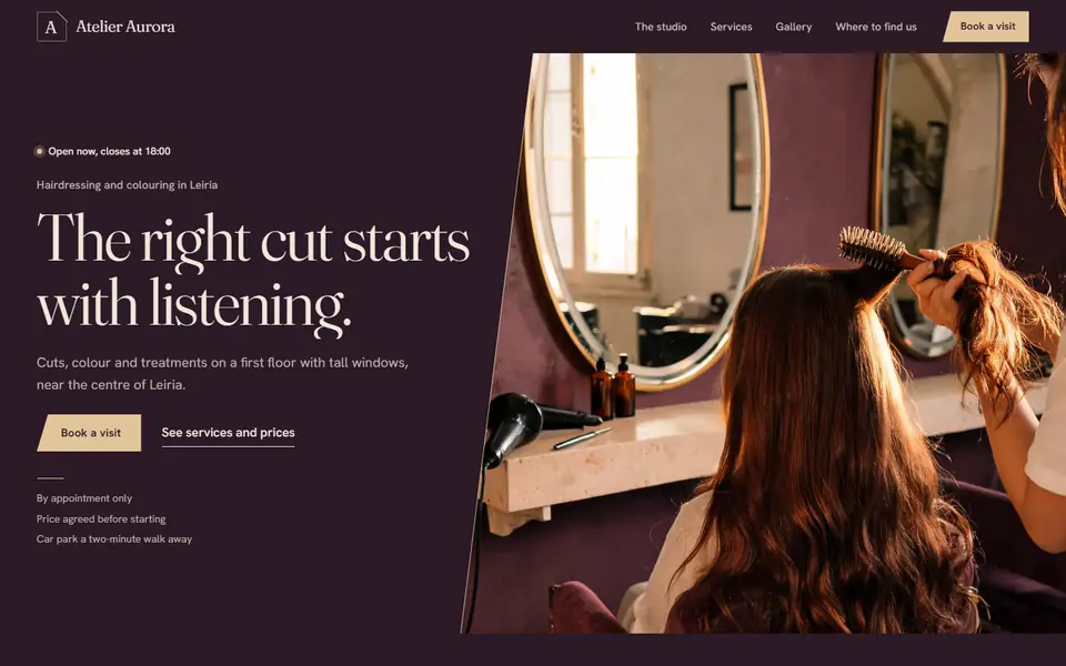 Explore the Salon template
The same request, from start to finish.
The catalogue, customiser and purchase process are connected parts of the project. Each stage has a purpose and an identifiable next action.
Choose
Explore designs and open the full template.
Open the catalogueTry it out
Adapt the branding, text, colours and sections.
Try personalising a templateReview
Transfer your choices to the purchase summary.
See how your choices are transferredOrder
Confirm the scope, details and payment terms.
Find out how to place an order
The problem: bringing the idea closer to what will be delivered
Anyone looking for a website needs to make decisions about its appearance, content, features and ongoing operation. An image of a page helps with choosing a style, but it does not show how navigation works or how the visitor's brand fits into that design. A quote request form, on its own, does not make that idea visible either.
We built a journey that lets visitors explore before ordering. The catalogue opens full demos; the personaliser lets visitors try changes in their chosen template; the purchase process receives those instructions. The product aim is to narrow the gap between 'I like this example' and 'this is how I imagine my website'. We do not present that aim as a measured commercial result.
What to take into your project
When assessing a provider, ask to open the full example and try the navigation as well as looking at the presentation image.
A shared catalogue for presentation and ordering
The current catalogue brings together 113 templates in 13 design families. The families share presentation structures, while each template has its own content, photographs and theme. Template names and identifiers are used by both the gallery and the purchase process, keeping the choice consistent between pages.
The demo identifies the business as fictional. An example contact button does not simulate an order from a real customer, and an appointment display should not be confused with an included booking system. We separated the visual experience from the commercial scope: the features being purchased are confirmed in the offer and the order.
What to take into your project
Check which elements are for demonstration, which work in the delivered product and which require an additional service.
The preview uses the chosen template
The personaliser loads the actual template and applies the choices to that page. You can change text, global colours and the colours of individual elements, upload a logo, adjust its size and rearrange or hide sections. Desktop and mobile views let you check the same choice at two widths.
There is an important difference between letting people try changes and publishing automatically. The editor prepares a visual reference for the work; it does not, by itself, turn a demo into the customer's public website. The draft stays in the browser tab being used. It is not a cloud account or a promise that the work can be recovered on another device.
We included comparison with the original and options to undo and redo. These choices make experimentation reversible. If a colour makes reading difficult, the visitor can reconsider it; if a long name does not fit in the header, they can compare the mobile view before continuing.
What to take into your project
Try a long name, real text and your own logo. Check the mobile result, whether changes can be undone and where the draft is stored.
Choices are transferred to the order for review
When you continue from the personaliser, the purchase form retrieves the instructions you prepared. The summary lets you review text, colours and organisation; the copy of the logo used in the preview appears in the materials. You can return to the personaliser before completing the order.
The journey distinguishes between public business information, materials and billing details. The purchase summary shows the template, payment method and selected website management option. The final submission is identified as an order with an obligation to pay: opening a demo or changing a colour does not amount to confirming a purchase.
After ordering, progress is tracked through a personal link showing the work's status and the next steps. Publication depends on preparing the materials and approving the final version. The help centre explains this process without exposing the administration area or information about other orders.
What to take into your project
Before commissioning the work, check that you can review what you requested, correct the materials and understand what happens between payment and publication.
Commercial content is also part of the system
Prices, products and company details share common data sources in the project. Pages use those sources, and the assistant's knowledge is generated from them. This choice aims to avoid having to repeat a price change manually on every page and in the information used for customer support.
The website's information pages are published as pre-rendered HTML. Necessary interactions, such as personalisation and purchasing, add their own behaviour. This separation makes the commercial content available without requiring visitors to run an entire application to read it.
The visual direction retains motion, with an alternative for people who prefer reduced motion. The operational side keeps actions identifiable: try, continue, review and confirm. Technical complexity only matters to the customer when it helps preserve information, make decisions clear and maintain the website over time.
What to take into your project
Compare the price and terms across the service information, purchase process and support. Ask who updates the information and how contradictory versions are avoided.
How much data does the page transfer on mobile?
At the top of our homepage, the template photograph was about 310 pixels wide on a 390-pixel-wide phone. With two physical pixels per CSS pixel, the 640 px photograph provided sufficient resolution. The browser was downloading the 1,280 px version.
We corrected the photograph’s size hint and when the browser requests it. We measured three visits to each public version. The volume of data transferred fell by about 30% at the median of the visits.
| Measurement | Before | After |
|---|---|---|
| Data transferred | 370.5 KiB | 258.6 KiB |
| Time to the largest visible element (LCP) | 3.06 s | 2.17 s |
| Time to first byte | 1.32 s | 0.89 s |
The main text appeared earlier in the test. The server response time and the element identified by the browser as the largest also changed. The reduction in photograph data can be checked directly in the network requests. The difference in total time combines the effects of these changes.
How to repeat the measurement
Open the homepage in a clean Chromium profile with the cache disabled. For mobile emulation, use 390 × 844 px, a pixel density of 2, CPU throttling by a factor of four, and a network with 4 Mbit/s download, 1 Mbit/s upload and 80 ms of additional latency. Record the first 11 seconds without clicking or scrolling. Repeat three times in new processes. Sort the three values for each metric and use the middle value. In the network tool, also check which photograph variant was transferred.
We used Chromium 158.0.8127.18. The test measures the page under these specific conditions. Assessing real visitors requires field data and a comparison of the 75th percentile.
Try it and draw your own conclusions.
You can carry out these checks without buying. In the purchase process, stop at the review of your choices; the final confirmation is identified as an order with an obligation to pay.
Open a template from the gallery.
The full page matches the thumbnail and identifies the example as fictional.
Distinguish a visual reference from work carried out for a customer.
In the personaliser, change a heading and a text colour.
The preview reflects the choices in the corresponding element.
Confirm that the content and identity can be worked on.
Upload a logo and adjust its size.
The logo keeps its proportions and can be checked in the mobile view.
Assess the brand in the available space before final production.
Move a section and use Undo.
The order changes and the change can be undone in the editor.
Experiment without being tied to the first choice.
Continue with the template and open 'View my choices'.
The purchase summary shows the instructions prepared in the personaliser.
Check continuity between the visual idea and the request.
Check the prices and approval steps.
You can identify the scope, payment and what happens before publication.
Make the decision with the terms available.
The work continues in our own products.
These systems also belong to Lyntev. Each has its own area of use, terms and demonstration with fictitious data. They are journeys to explore, not customer references.
See how we tested appointment rescheduling in Clínicas Pro, using fictitious data.
ContactoIA
Automated AI customer service on WhatsApp
The AI answers using information from your business. You can organise enquiries, contacts and opportunities on a board with stages (Kanban CRM). Follow each conversation.
AI replies based on your business rules
Enter your services, prices, opening hours and business rules. Test the replies in the lab. Only then activate the assistant on WhatsApp.
Terms and limits to consider
- Connects as a WhatsApp linked device, rather than through Meta’s official API; use remains subject to WhatsApp’s rules.
- Interprets voice notes and compatible audio messages, processing them internally in parts when needed, and replies to the enquiry in writing without sending the transcript to the customer. Included in every plan and the trial, within the reply allowance and with valid access.
- Images, videos and documents are not interpreted: only their accompanying text may be considered. No campaigns or bulk messaging.
BeautyFlow IA
Management software for beauty and hair salons
A simple system built for beauty salons. It brings together calendars for each professional, online booking, clients, packages and finances.
Online booking, at any time
Each salon has its own public booking link. Clients book at a time that suits them, and a client record is created.
Terms and limits to consider
- SMS messages are sent from the salon’s own mobile; WhatsApp messages are sent manually.
- This is not certified invoicing software.
Clínicas Pro
Management software for clinics and practices
Organise appointments, follow up with patients and see what is due to be received. Each team member accesses the tools they need.
Video consultations for healthcare professionals
Patients can join through the appointment link from 15 minutes before the appointment time. They can use a mobile phone or computer without installing anything. Remote consultations are included in every plan.
Terms and limits to consider
- This is not certified invoicing software: clinical services are invoiced in the clinic’s certified software.
- WhatsApp reminders are messages ready to send; automated SMS messages are sent from the clinic’s mobile.
What this study can help you decide.
A website can present an offer and connect it to the process that follows: gathering information, preparing a choice, receiving a request and allowing progress to be followed. The right journey depends on the business and the agreed scope.
To prepare your project, describe the visitor’s main action, what they need to review before confirming, and the information that must reach the team. These three decisions help distinguish a presentation website, an automation and a bespoke system.